
Decision-support tools are interactive features that take a visitor's own situation and return something specific to it: an estimate, a recommendation, a comparison, or a next step. On a website, they work best as part of a journey, connected to the pages that explain the decision and the pages that act on it.
What makes a website a decision tool
The difference shows up in the question a page answers. An article answers what someone needs to know. A tool answers what it means for them specifically. Both are useful. A site that only does the first leaves the hardest part, applying it, to the visitor.
PetCareHall made this concrete for me. It had the same domain and many of the same articles it had a year earlier. What changed was twelve working tools sitting next to those articles: a Breed Selector, Symptom Checker, Vet Locator, Diet Planner, Food Calculator, Insurance Calculator, Cost Estimator, Vet Cost Estimator, Comparison Tool, Cost Comparison page, Product Finder, and Checklist Generator. The site stopped being somewhere people read and became something people use. Here's how that happened.
Six types of decision-support tools
Almost every tool I've built falls into one of these. Picking the right type starts with the question the visitor is actually asking.
Assessments
Figure out where someone is right now, then route them.
Example: BizCredX Business Credit AssessmentEligibility checkers
Check a situation against rules and return a likely result.
Example: SavedNest Benefits Eligibility CheckerCalculators
Turn a visitor's own numbers into an estimate.
Example: HSAMaxGuide contribution calculatorComparisons and databases
Line options up against the criteria that decide the choice.
Example: TechPathU certification comparisonsDecision trees
Ask a few questions and narrow to one path.
Example: FixRN DIY versus professional guidesFinders and planners
Match a person to a route, product, or plan.
Example: TechPathU Pathway Finder, PetCareHall Breed Selector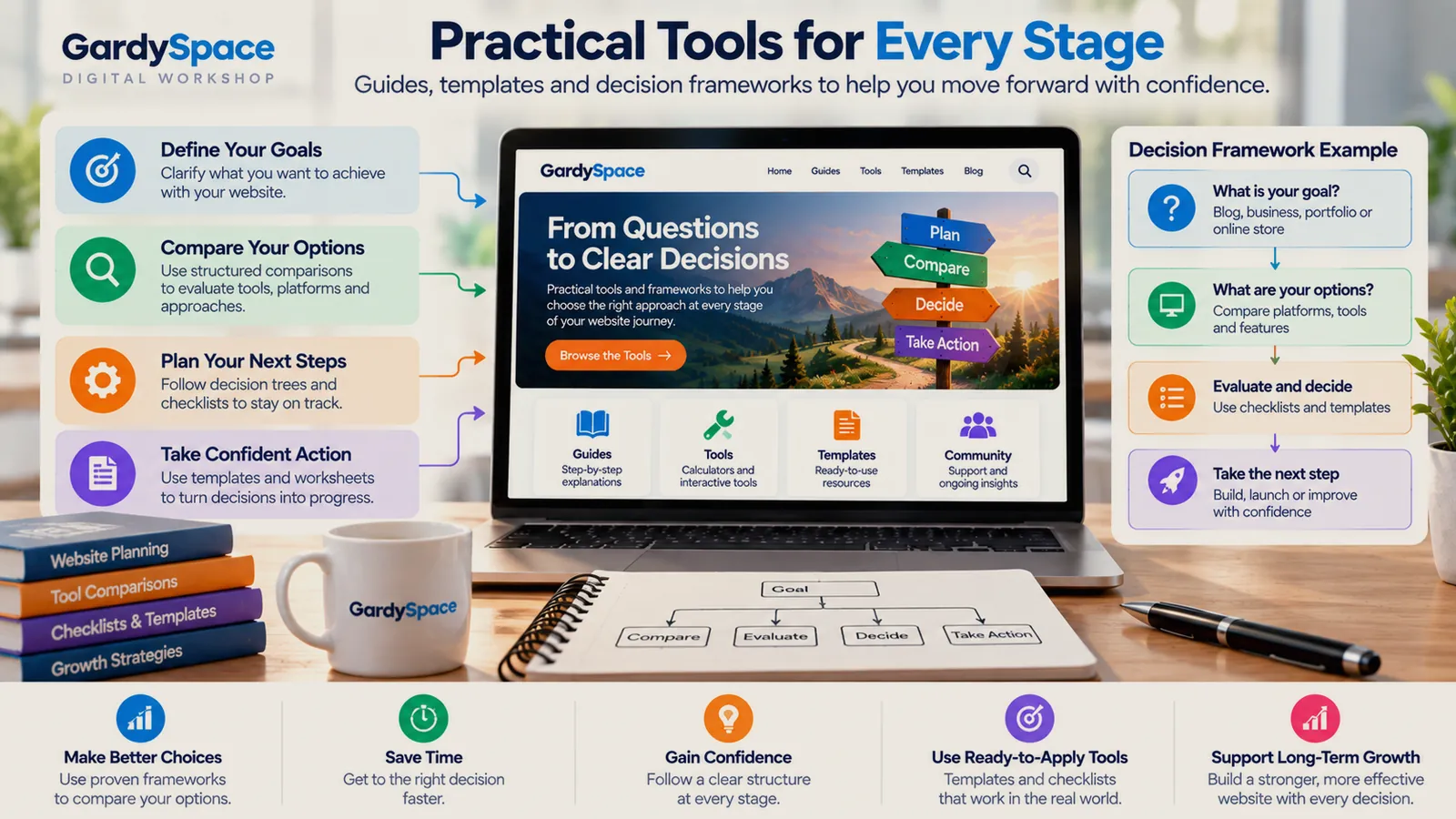
When a website needs a tool instead of an article
Not every topic needs a calculator. These are the signals I look for before building one:
- The honest answer is it depends. And it depends on things the visitor knows about themselves: income, location, budget, starting point.
- The questions start with which one. Once people ask which Net-30 vendors report to which bureau, prose stops helping and a sortable table starts.
- Search Console shows how much and do I qualify. SavedNest was getting impressions for retirement tax calculator and Medicaid eligibility queries. Those are tool-shaped searches.
- Readers need several articles to answer one question. If someone has to read fifteen pages to understand their own situation, a tool can do the assembling.
How to design a decision-support website
-
Name the decision
Write it as the visitor would say it. Should I call a plumber tonight? Which certification comes first? Do I qualify? If you can't state the decision in one sentence, the tool will be vague too.
-
Choose the fewest inputs that change the answer
TechPathU's Pathway Finder asks about three things: background, target lane, and realistic budget. Every extra question costs completions, so each one has to change the result.
-
Design the result as a next step
The output should say what the result is, why, and where to go now. A sequence of certifications with cost and timeline is a plan. A score with nothing after it is trivia.
-
Connect it to the content around it
Articles should lead into the tool at the moment the reader needs it, and the tool's result should link out to the guides that explain it. A contribution calculator belongs right after the article on contribution limits.
-
State the limits and date the figures
Say what the tool assumes, which year's rules it uses, and whether the result is an estimate. HSAMaxGuide's calculator names the 2026 limits it uses, and those figures need updating every year.
-
Measure completions, not visits
Track how many people finish the tool and click the next step. A tool with traffic and no completions has a question-design problem.
Decision tree UX
Decision trees are the simplest tool to build and the easiest to get wrong. Here's an illustrative one for the kind of choice FixRN's DIY-versus-professional guides help with:
Is water actively leaking?
├── No  → Monitor it, and read the cause guide
└── Yes → Can you shut off the water?
          ├── No  → Call a professional now
          └── Yes → Is it near anything electrical?
                    ├── Yes → Call a professional now
                    └── No  → Is it a fixture you can reach?
                              ├── Yes → A DIY fix may work: see the guide
                              └── No  → Book a professional: see costs
Every branch ends somewhere specific. That's the rule that matters most. The others:
- Put safety-critical questions first. The urgent branches should resolve in one or two taps.
- Keep questions answerable without research. If the visitor has to look something up, they'll leave.
- Show progress and allow going back. People need to see how many questions are left and fix a wrong answer.
- Explain the result. Say which answers led there, so the visitor can trust it or disagree with it.
How a tool fits the wider visitor journey is covered on UX and information architecture.
Trust and monetization
Tools take a position in a way articles don't. The moment a site says here's what we think fits you, it owes the visitor an honest answer about why. Three things I hold to:
Neutrality is a UX feature
TechPathU can earn from bootcamps, and the Pathway Finder still tells some people to skip the bootcamp. If a tool can't recommend against the thing that pays, it's a funnel with a quiz on top.
Estimates say they're estimates
SavedNest's eligibility checker is clear that its result is informational, not an official determination, and points to the agency that makes the real decision.
The third is disclosure. If the site earns from an option the tool recommends, the page says so plainly, near the result, not only in a footer link. In financial and health topics, qualify every requirement, fee, and threshold, and verify it against primary sources.
Mistakes to avoid
A tool that leaves you nowhere
A quiz that produces a result and no next page is just another isolated page. The tool only matters if the rest of the site can support its result.
Tools hidden in a folder
A calculator parked in a tools directory, waiting to be found, is easy to miss. It should sit inside the articles where the question comes up.
A broken last step
TaxRefundSeed's four-stage framework once ended at a checkout that didn't work. A decision path is only as good as its final click. What that taught me (publishes Oct 20).
The design process as a framework: decision models, a decision tree canvas, recommendation rules, edge cases, and a trust checklist for tools that involve money. Printable and fillable PDF, $39.
Get it for $39See all five products
Sold through the IGNE Publishing shop, my business entity.
See it in real projects
Each of these grew from information into tools that help someone decide.
PetCareHall
Turn useful information into a connected problem-solving experience.
View the projectSavedNest
Organize a consumer-facing decision experience around real questions rather than isolated articles.
View the projectTechPathU
Turn broad technology-career information into a connected decision path from a person’s starting point to a realistic next move.
View the projectBizCredX
Make a business-focused property easy to search, scan, and navigate.
View the projectDecision-support tools FAQ
What is a decision-support tool on a website?
A decision-support tool is an interactive feature that takes a visitor's own situation and returns something specific to it: an estimate, a recommendation, a comparison, or a next step. Calculators, eligibility checkers, assessments, comparison tables, and decision trees are all examples.
When should a website use a calculator instead of an article?
When the honest answer to the question is it depends, and it depends on things the visitor knows about themselves. If people keep asking how much, do I qualify, or which one is right for me, an article can explain the factors, but a tool can apply them.
What makes a good decision tree?
Few questions, each one clearly worded, with a visible sense of progress and a way to go back. The result should explain why it came out that way and lead to a specific next page or action. A decision tree that ends with a verdict and nothing else is a dead end.
Are online decision tools trustworthy?
Only if they're honest about their limits. A good tool says what it assumes, shows where its figures come from and how current they are, and makes clear when a result is an estimate rather than an official determination. If the site earns money from the options it recommends, it should say so.
Do interactive tools help SEO?
They can. Tools often earn links and answer commercial searches better than articles do. But a tool on its own is thin content to a search engine. The tool works best inside a cluster of explanatory pages that link to it and that it links back to.
Do I need to code to build a decision-support tool?
Simple ones, like a checklist or a short decision tree, can be built with basic HTML and a little JavaScript. Calculators with real rules, like contribution limits or eligibility thresholds, take more care, mostly in keeping the underlying figures accurate and dated.
Worth thinking about
- What's the question your visitors ask most where the honest answer is it depends? What would they need to tell you to get a real answer?
- If your site recommended against the thing that earns you money, would it still recommend it when it was right?
Page history
- The companion product is now available through the IGNE Publishing shop.
- First published: what makes a site a decision tool, six tool types with real examples, when to build a tool, design process, decision tree UX, trust and monetization, and FAQ.
Have a site full of information that people still can't apply to themselves? Turning that into a tool is some of the most useful work I do.
Work with Gardy